
Pando Design System
usana health sciences
I was the primary designer from start to finish, leading discovery, design, development, prototyping, usability testing, and ongoing support. I helped establish the foundation for Pando and worked across design and development to turn that foundation into a practical, scalable system.
I was the primary designer throughout the project, working from discovery and research through UX/UI design, prototyping, usability testing, development, documentation, and ongoing maintenance.
I worked closely with designers, developers, product owners, marketing, and stakeholders to identify common needs and turn them into reusable components, patterns, and guidelines.
My role extended beyond designing the interface. I helped define how the system would be organized, documented, used, maintained, and continued to evolve.
As USANA’s digital platforms continued to grow, designers and developers were often solving similar problems in different ways. Components, patterns, and visual decisions could vary from one experience to another, making it more difficult to create and maintain a consistent experience.
The goal of Pando was to establish a shared foundation that designers, developers, and other teams could use to create digital experiences more efficiently and consistently.
Rather than creating a collection of individual components, we needed a system that could provide reusable building blocks, clear guidelines, documentation, and a shared language for design and development.
Before building the system, I led an audit of USANA’s existing digital experiences to understand what was working, where inconsistencies existed, and which patterns could become reusable system elements.
The audit included:
The audit helped identify opportunities to consolidate repeated solutions and establish a stronger foundation for the system.
It also gave us a clearer picture of where existing brand and digital standards needed to be translated into a usable digital experience.


With the audit complete, we began establishing the foundational rules that would support the system.
This included defining:
The goal was not simply to create visual standards. These foundations needed to provide enough structure to create consistency while remaining flexible enough to support different products and experiences.
With the foundation established, I designed and built the reusable components and patterns that became the backbone of Pando.
Each component was considered not only as a visual element, but as a reusable design and development solution.
We defined variations, states, behavior, spacing, anatomy, accessibility requirements, and usage guidelines so that designers and developers could understand not only what a component looked like, but how and when it should be used.
UI Kit
A core part of Pando was the Figma UI Kit.
The UI Kit provided designers with a shared collection of components, styles, typography, and other visual assets that could be used to create experiences using the same underlying system.
This gave designers a common starting point while making it easier to keep the design work connected to the broader Pando system.
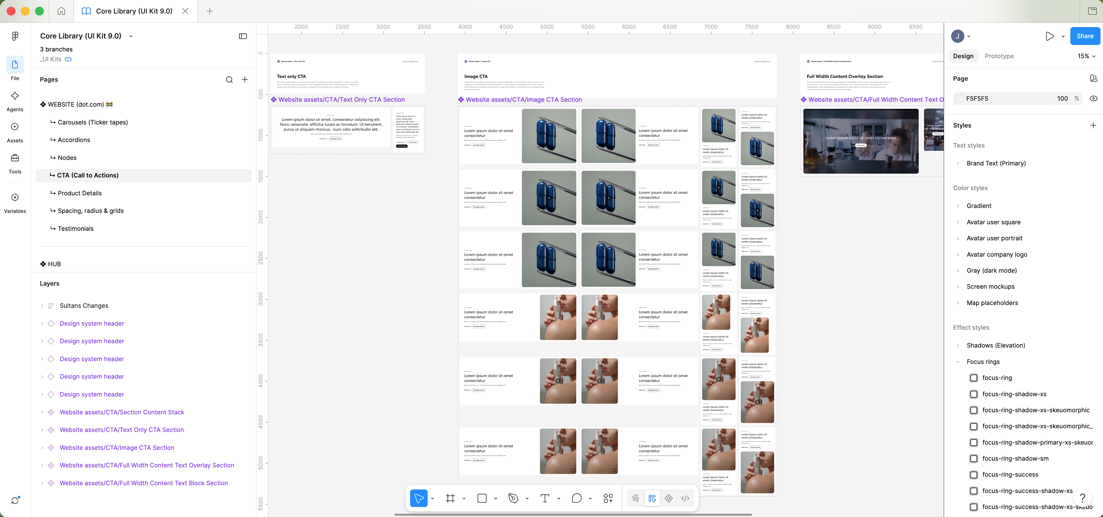

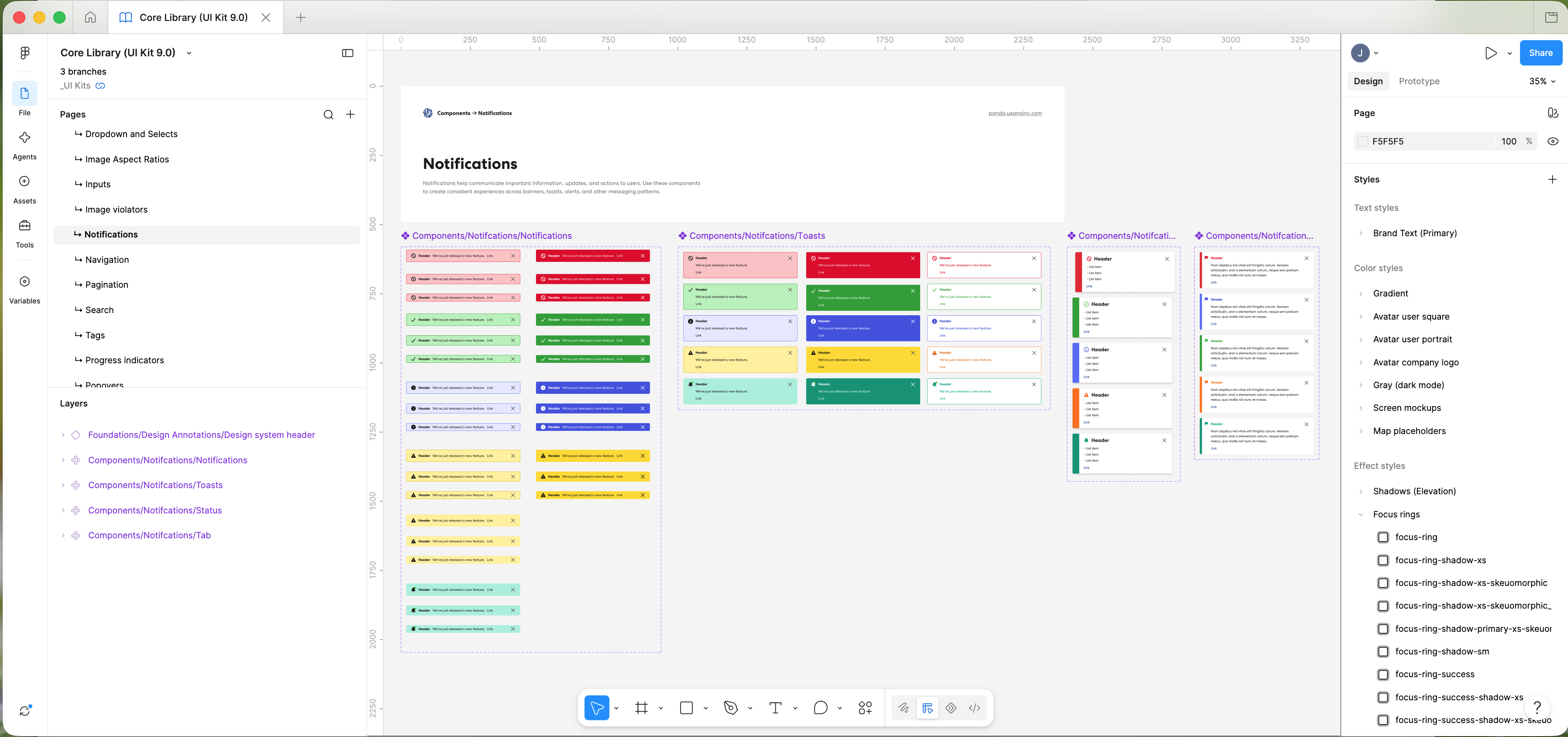
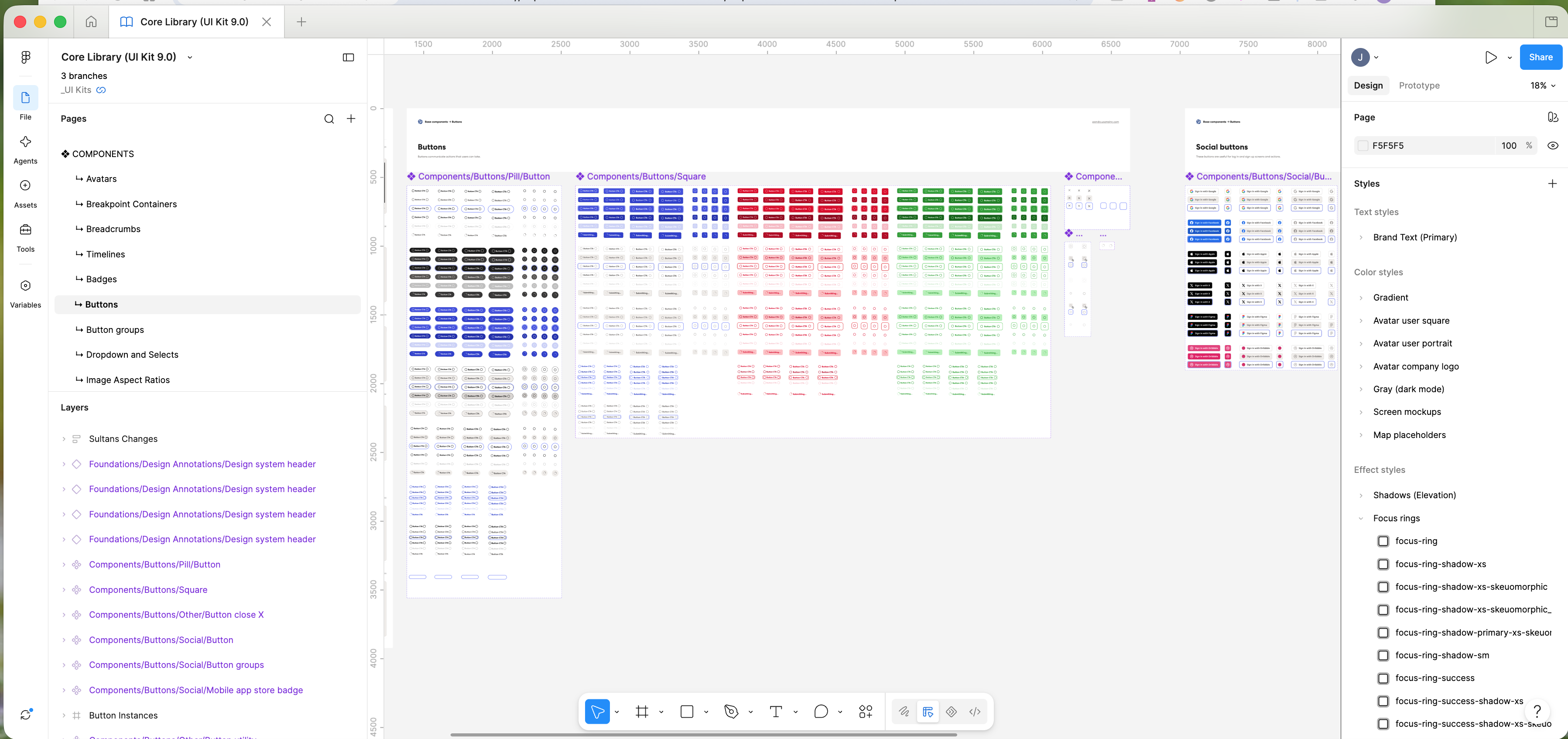
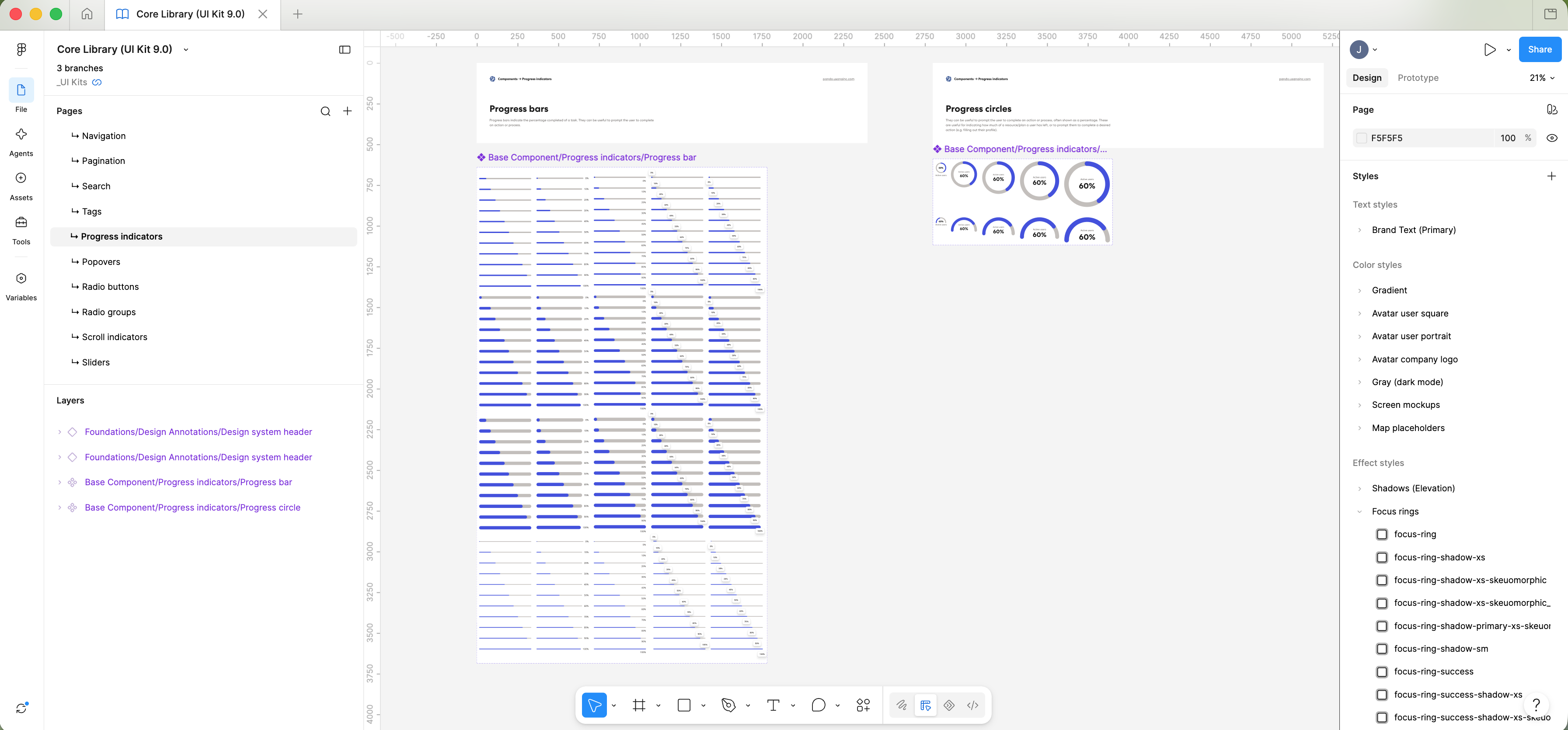
Pando was designed to work beyond Figma.
The system needed to be usable by developers and ultimately represented in the products and experiences being built. I worked closely with development throughout the process to make sure the design decisions could be translated into working interfaces.
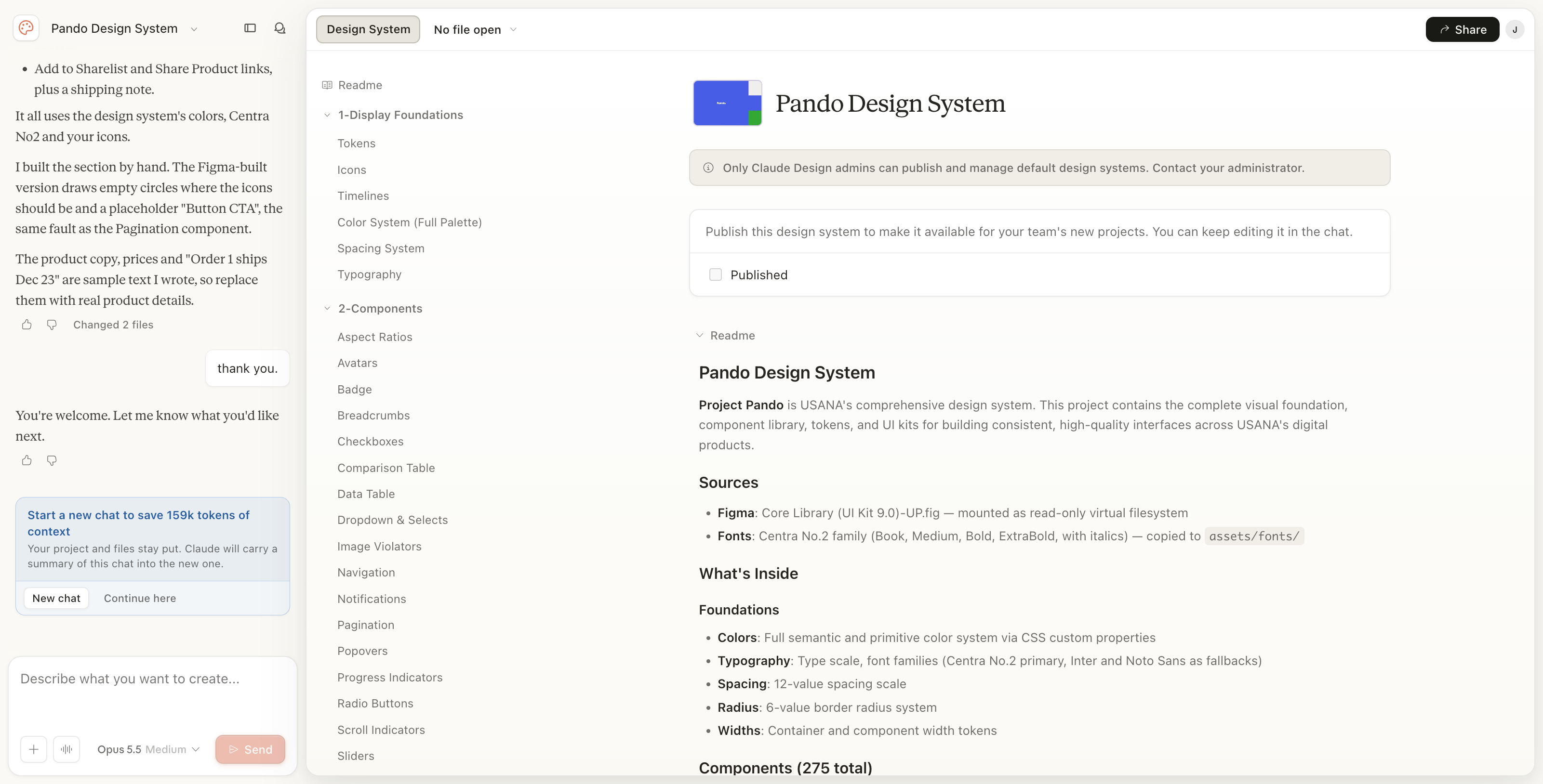
The system connected the design work in Figma with documentation and the development environment, creating a closer relationship between what designers designed and what developers built.
This collaboration also created an ongoing feedback loop. Components could be designed, tested, implemented, evaluated, and refined rather than treating design and development as separate stages.
A design system is only useful if people can understand and use it.
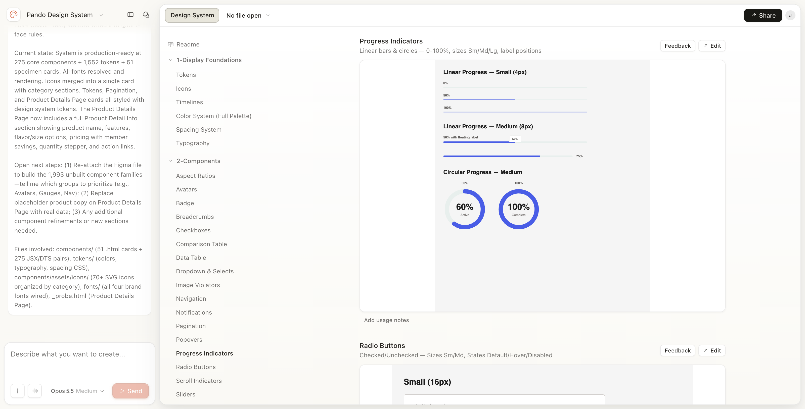
Documentation became an important part of Pando, providing designers and developers with the information they needed to work with each component.
Documentation covered areas such as:
The goal was to make the system practical—not simply a library of components, but a resource that explained how those components should be used.
We used tools including Figma, Confluence, JIRA, Milanote, and the Pando website to document the work and keep teams connected.
Pando was designed as a living system rather than a finished project.
As new needs emerged, designers and developers could submit requests, propose changes, and identify opportunities to expand or improve the system. Those requests could then be reviewed and incorporated into the system when appropriate.
Ongoing maintenance also meant keeping components, documentation, accessibility standards, and best practices current.
This created a continuous cycle of contribution, review, implementation, and refinement.
Pando established a shared foundation for USANA’s digital design and development teams.
It brought reusable components, documented guidelines, and a common design language together in one system, giving teams a more consistent way to design, build, and maintain digital experiences.
More importantly, Pando created a framework that could continue to grow with USANA rather than requiring teams to solve the same design problems over and over again.
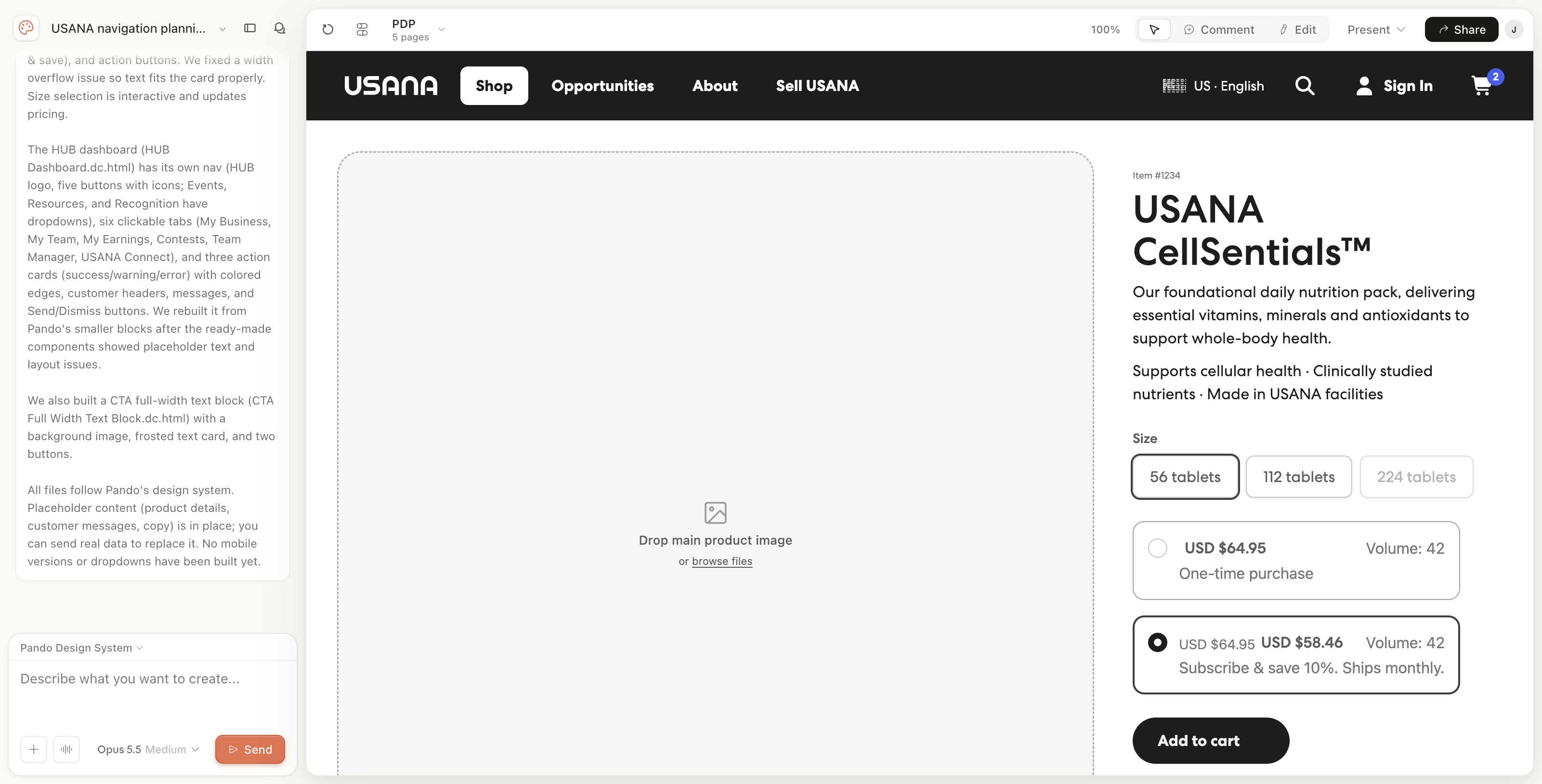
More recently, I’ve been exploring how Pando can work with AI rather than simply being used by designers and developers.
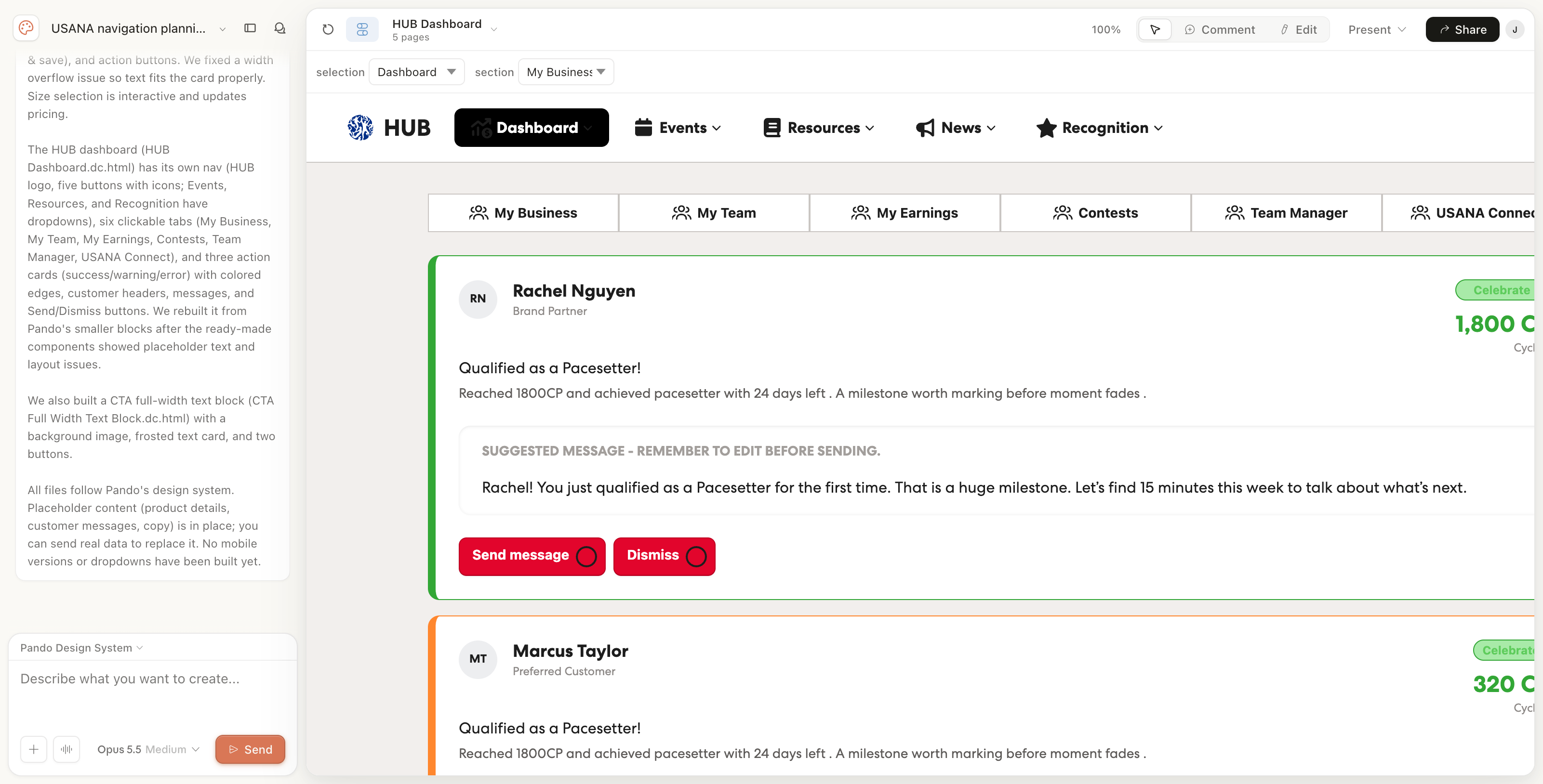
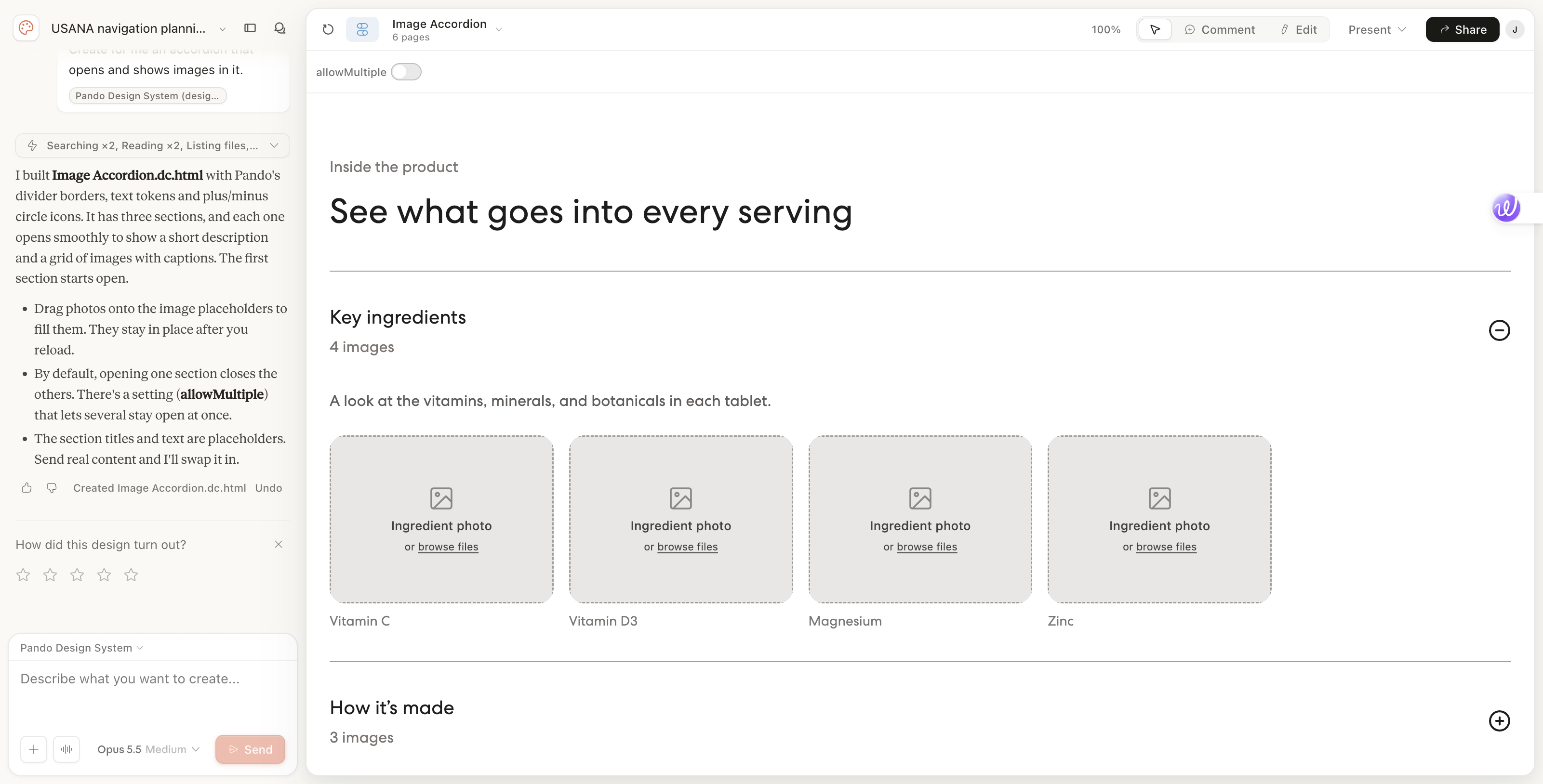
Using Claude and Claude Code, I’m building out the system so AI can understand Pando’s components, standards, and rules and use them through natural-language commands. The goal is to move beyond simply referencing a design system and make it something AI can actively work with—creating and modifying components based on the same standards designers and developers use.
I’ve also been working with our development team to build AI agents that check designs and changes against Pando. These agents can review submitted work against the system’s guidelines and identify where designs or implementations may not follow established standards.
This is an ongoing part of Pando’s evolution: making the system understandable not only to people, but to the AI tools increasingly becoming part of how we design and build digital experiences.
Pando established a shared foundation for USANA’s digital design and development teams.
It brought reusable components, documented guidelines, and a common design language together in one system, giving teams a more consistent way to design, build, and maintain digital experiences.
More importantly, Pando created a framework that could continue to grow with USANA rather than requiring teams to solve the same design problems over and over again.
Today, that evolution is extending into AI, where I’m working to make Pando usable by both people and AI-driven design and development tools.
Building Pando reinforced something I've learned throughout my career: a design system is about much more than components.
The components are the visible part of the system, but the real value comes from creating shared understanding—between designers, developers, product teams, and stakeholders.
A successful system needs to be useful enough that people want to use it, flexible enough to support real-world needs, and structured enough to continue evolving as the organization changes.
Pando continues to evolve, and so does my role in helping shape it.
